|

GEOGRAPHIC INFORMATION SYSTEMS (GIS) |
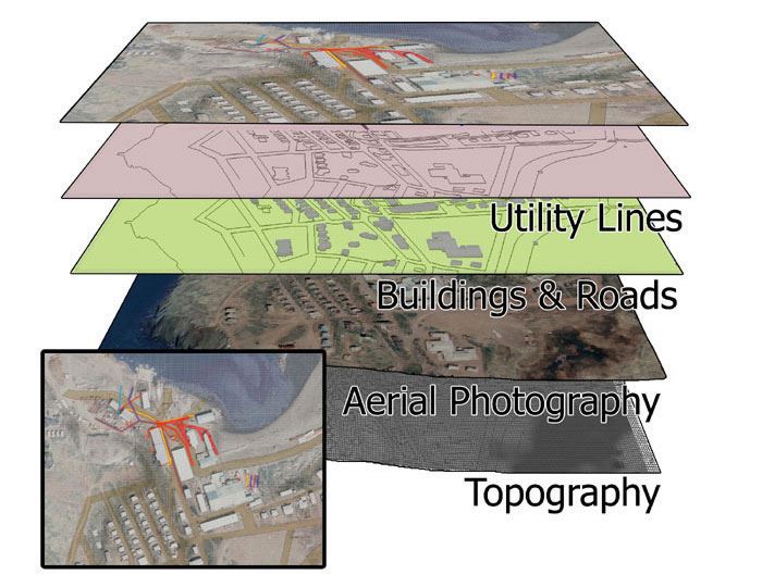
Geographic Information Systems (GIS) became possible in the 70s and 80s but were experimental in nature and required large and expensive computer systems to implement. With the technology revolution of the past two decades that all changed and GIS has come of age since the 90s. So what is GIS? Reverse the letters and you have the answer: a GIS is a System (of hardware and software) to manage Information (or data) that is Geographically (i.e.) referenced. So maybe you could call it SIG as well (especially if you speak a romance language). The visualization of information is inherent in this technology.See image 1, right.
A classic depiction of the data in a GIS. Each “layer’ of data is geographically referenced (I.e. by position). This allows the images to be overlaid accurately to visualize relationships. One can also drill down through layers to see the geographically related items (e.g. pipes under streets) or identify proximities (e.g. population within a radius from a storage tank).[/caption] In a matter of a few years we have gone from laboriously plotting data on maps by hand to having a GIS on your laptop (even phone) with full graphic displays. The revolution was possible through the rapid growth in the power (speed and storage) of computers to replace the manual labor, the explosion of data provided by remote sensing and digitization of all matter of data, and the ability to position reference the data elements to build the relationships between disparate databases. The concept of GIS is often and appropriately depicted as a base map with layers of information overlaid on it such as the image to the right. A GIS can be like an extensively annotated map. It can also be a geo-referenced database with hardly a map to be found in it. And it can a model that takes geo-referenced data and creates new geo-referenced data based on rules or hypotheses – think earthquake prediction based on seismic and ground movement measurements and historical fault data. We’ll only offer only a few examples of GIS here as there is almost no limit to the potential list of examples. We’ll add more on the Map & Stories page as interesting examples identified by our members. Early in the development of GIS, the hardware requirements to process the massive amounts of data were the constraining factor in its adoption. Early systems were often proprietary and tied to a manufacturer’s particular machine(s). This was a specialty line of business for a few large computer manufacturers and thus limited in its application to institutional / government applications. Not so today. The hardware limitation has largely been solved and now a substantial GIS can be hosted on a desktop computer.
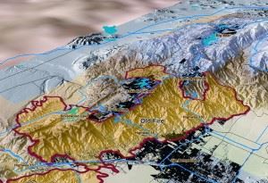
A GIS can be used to create complex maps. In October 2003, fires raged throughout Southern California in San Diego, San Bernardino, Los Angeles, Ventura, and Riverside counties. They scorched hundreds of thousands of acres, displaced tens of thousands of people, and destroyed thousands of homes. As emergency responders worked to put out the fires with every resource available, computer mapping played a key role in many areas. This map was created by ESRI’s technical marketing team for the San Bernardino County Sheriff’s department to assist the sheriff’s emergency operations center. The map shows the current Old Fire and Grand Prix Fire perimeters on November 1, 2003. The fire perimeter data was captured using aerial equipment and GPS. The perimeter is overlaid with digital elevation data and local transportation data. The map was created by Mark Reddick and is provided courtesy of ESRI, Map Book Gallery, Volume 19.[/caption] The software for GIS started on mainframes, moved to workstations in the 80s, desktops in the 90s, and web based (“cloud”) solutions in this century. By far the leading software manufacturer who has done the most to define GIS and whose products are used by 80% of the GIS professionals in the world is California’s ESRI, Environmental Systems Research Institute, in Redlands, California. It is hard to overstate the credit that is due to ESRI, the proverbial 800 pound gorilla, for the development of the GIS industry. One should visit at least one of their websites to understand GIS and their range of products and services. One of the most interesting of their sites, ESRI’s Map Book Gallery, http://www.esri.com/mapmuseum/ provides some of the best examples of GIS one can find. With ESRI’s permission, a couple examples are shown on this page. MapInfo is the next largest GIS software company and is focused somewhat on business applications. Founded in the 80s and acquired by Pitney Bowes, MapInfo especially supports retail location analyses, business intelligence, market research, and facilities management applications. Another firm, Small World who was acquired by GE, aims its products at utility and telecomm management needs. Many legacy systems continue to use Autodesk and Intergraph products. The entire GIS software space includes image processing and utility software. Image processing is the conversion of raw data (e.g. from remote sensing from aircraft or satellite images) into useable (e.g. geo-referenced) data. Providers such as ERDAS and IDRESI can provide image processing services or image processing software for you to do your own conversions. There are a number of software utilities that can enable you to do much of your own data management for your own GIS. MyTopo, Blue Marble and Global Mapper each have their unique niches to provide a means to convert data into useable formats. The offerings of most of these companies span more than the fields noted here and many of them also provide data.
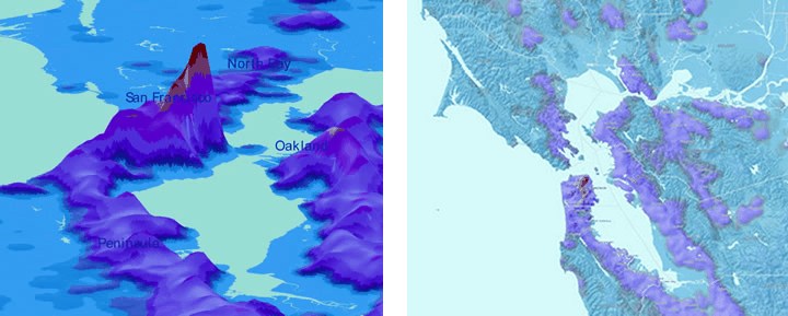
A GIS can be used for a database as displayed in these images. These maps depict multidimensional surface derived from population density distribution within the nine-county San Francisco Bay Area in 2000 census. A hill shade grid was layered beneath the grid depicting population density from which it was derived. In effect, this creates a shaded relief image of the Bay Area that is derived from population distribution rather than topography. As depicted in ArcScene, the inset maps show the same dataset, with heights obtained from the population field. A 0.25 factor was used to account for the extreme heights of these data values in relation to the size of the Bay Area landscape. Maps are courtesy of Garlynn G. Woodsong, Metropolitan Transportation Commission, and ESRI. See ESRI Map Book Gallery, Volume 22.[/caption] Fairly sophisticated GIS projects can now be undertaken with open-source software such as MapServer, PostGIS, and GRASS GIS for folks working on a limited budget. At the personal level a number of web based tools (e.g. those offered by Google Maps and Google Earth) are available to create fun and useful systems. These low cost desktop and web based software tools along with the widening availability of data are enabling a new field for us cartographers we call do-it-yourself maps.
A GIS can be used for modeling spatial effects. The Desertification Vulnerability map is based on a reclassification of the global soil climate map and global soil map. It is useful for teachers and students who are interested in the global distribution of desertification vulnerability. Global modelers may be able to use the data for small scale analysis.Note the data sources:Source: Soil map and soil climate map, USDA-NRCS, Soil Survey Division, World Soil Resources, Washington D.C.Data Aggregation and Reliability: The Desertification Vulnerability map data is rasterized on a 2 minute grid cell.Data Definitions: Four vulnerability classes are defined based on soil climate and soil classification[/caption] Once you have the hardware and software, all you need is data to process. A GIS can be part of a system to capture the data as in the differential GPS systems used in remote sensing. The more common situation is you need to acquire some map data and some other geo-referenced data to combine for analysis and presentation in your GIS. In the 80s getting this data could have been an insurmountable task. Today all kinds of information are readily available, some for even for free and at your desktop over the web. If you want to spend a little money a most anything can be acquired. One note about data: you will hear the terms raster data and vector data tossed about frequently. Think of raster data as an image or a picture. It’s essentially data in pixel form. It used to only be the color and intensity information for the pixel necessary for printing as an example. With GIS, information such as position and other characteristics can be ascribed to a pixel as well which, through this georeferencing, makes the raster data useful to the system. Before this was practical, folks based most GIS on vector data, information that can be expressed as points, lines, or polygons. Some types of data are best suited to a vector format – population statistics can’t be well represented as a point or pixel, they are related to an area whether it is a country or a city block. Most GIS software today is fluent to some degree in both raster and vector data. If not, there are conversion software utilities to help make the data useable. All along here we’ve assumed that the position information needed in GIS is obvious and sort of mundane. That’s really not the case. There are a multitude of coordinate systems in use for mapping and therefore GIS data and software. There’s a good reason for almost all of them. We’ll avoid the mathematics here but, if you’re so inclined, research geodesy to get started. EXTRATERRESTRIAL GIS
So if you think GIS is out in left field, what about a GIS for the solar system bodies like the Moon, Mars and the moons of Jupiter? There are few options available for budding cartographers and lovers of GIS. Here’s a free one called PIGWAD.NASA’s Planetary Geology and Geophysics Program and the USGS in Flagstaff have chosen to support a planetary, Web-based GIS and planetary GIS support site that the entire science community may use with these objectives:
So what is PIGWAD? If you’re familiar with classic government acronym generation, it’s almost obvious: Planetary Interactive G.I.S.-on-the-Web Analyzable Database. You should visit it at http://webgis.wr.usgs.gov/. You won’t need an avatar to play in these remote worlds. So through the evolution of digital technology, the new means to collect geographic information through remote sensing, and the ability to precisely position the data, we are now able to create an amazing array of Geographic Information Systems. What was once a sketch on a wall of a cave is now a three-dimensional, geographically accurate portrayal of our visible and invisible worlds. |
Image 1. A classic depiction of the data in a GIS. Each “layer’ of data is geographically referenced (I.e. by position). This allows the images to be overlaid accurately to visualize relationships. One can also drill down through layers to see the geographically related items (e.g. pipes under streets) or identify proximities (e.g. population within a radius from a storage tank).
Image 2. A GIS can be used to create complex maps. In October 2003, fires raged throughout Southern California in San Diego, San Bernardino, Los Angeles, Ventura, and Riverside counties. They scorched hundreds of thousands of acres, displaced tens of thousands of people, and destroyed thousands of homes. As emergency responders worked to put out the fires with every resource available, computer mapping played a key role in many areas. This map was created by ESRI’s technical marketing team for the San Bernardino County Sheriff’s department to assist the sheriff’s emergency operations center. The map shows the current Old Fire and Grand Prix Fire perimeters on November 1, 2003. The fire perimeter data was captured using aerial equipment and GPS. The perimeter is overlaid with digital elevation data and local transportation data. The map was created by Mark Reddick and is provided courtesy of ESRI, Map Book Gallery, Volume 19.
Image 3. A GIS can be used for a database as displayed in these images. These maps depict multidimensional surface derived from population density distribution within the nine-county San Francisco Bay Area in 2000 census. A hill shade grid was layered beneath the grid depicting population density from which it was derived. In effect, this creates a shaded relief image of the Bay Area that is derived from population distribution rather than topography. As depicted in ArcScene, the inset maps show the same dataset, with heights obtained from the population field. A 0.25 factor was used to account for the extreme heights of these data values in relation to the size of the Bay Area landscape. Maps are courtesy of Garlynn G. Woodsong, Metropolitan Transportation Commission, and ESRI. See ESRI Map Book Gallery, Volume 22.
Image 4. The Desertification Vulnerability map is based on a reclassification of the global soil climate map and global soil map. It is useful for teachers and students who are interested in the global distribution of desertification vulnerability. Global modelers may be able to use the data for small scale analysis. Note the data sources: Source: Soil map and soil climate map, USDA-NRCS, Soil Survey Division, World Soil Resources, Washington D.C. Data Aggregation and Reliability: The Desertification Vulnerability map data is rasterized on a 2 minute grid cell. Data Definitions: Four vulnerability classes are defined based on soil climate and soil classification
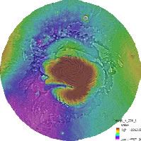
Image 5. Depiction of the elevation data of a polar region of Mars courtesy USGS and NASA. |